
most of you have seen this image- No?
Well suppose I said it was some of my work-( IT IS NOT) but
what IF?
If you know the designer try to separate yourself from the designer and really think about this one-
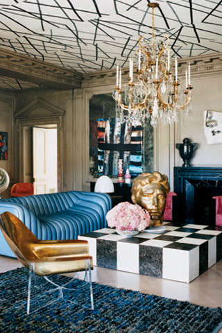
What do you really think about this room?
Room designed by Kelly Wearstler
.
take out the furniture and it's great !
ReplyDeleteI am not an interior designer, but it looks very bottom heavy and distorted. A bit like the film design for "The Cabinet of Dr. Caligari" 1919 (a must see). I understand this decorator is very a la mode. Too sacrosanct?
ReplyDeleteAs a little side lounge in a super-trendy boutique hotel, it's--well, it's not unlike a lot of lounges in boutique hotels, so I guess it's probably OK. Somebody must like staying at those places. As a stage set, given the proper lighting, it could be fine. As a "real" room for "real" people, it's a mess, although this is, presumably, Hollywood we're talking about. I sure hope.
ReplyDeleteAny of the oddball touches--the giant gold head, the Pick-Up-Stix ceiling, the ping-pong-ball-shaped bouquet, the superscale checkerboard table--might be a good addition to a too-traditional ensemble that needs a kick in the pants, and, in the right place, even two of them might work, but that's about the limit. This is way too many 'quirky' pieces for any single room. It's become a cartoon of a room, where normal people would look totally out of place. It reminds me of a cattle call for the character parts in a David Lynch movie, with everyone trying to out-weird the others. CUT!
I think THE ROOM is absolutely magnificent, legendary is really the word.
ReplyDeleteThe furnishings are another matter...the color scheme and placement of Blue, Black, Gold and Pink is well thought of, but the bulbous sofa, the Gold Head, and THAT coffee table with THAT papered ceiling WITH those beauifully carved bracket mouldings is ALL out of visual scale.
I know she takes from Haines and others...but they ALWAYS mixed the periods, Paintings could be Modern, a Louis Louis chair here, a Ming altar table bleached, Mayan sculpture here and there with Tang mixed in for fun...Crewel work pillows or upholstery on a totally fab modern sofa UPHOLSTERED in a non-screaming manner yes...but all this is very CLOCKWORK ORANGE or 2001 A SPACE ODYSSEY.
BUT YES, THE ROOM IS BEAUTIFUL!!!!!!!!!!!!
It's a mess!
ReplyDeleteWell I'll be damned. With a little editing, it could be mistaken for one of those fablous sets from an Italian movie of the 1970s.
ReplyDeleteI'd need aspirin...
ReplyDeleteI do not claim to know anything about decorating but I know what I like and this is certainly not it. It gives me a feeling of being off balance. I would not be comfortable in that room and probably would avoid it.
ReplyDeleteMagna beat me to the pickup stick ceiling. I like living with stuff, but this stuff is too stuffed. There isn't a feeling of harmony or comfort. I am so not into KW!
ReplyDeleteI know she is all the rage, but I find her rooms often rather garish. They look like rooms designed by amateurs, or in this case children with an unlimited budget. You know, it is really like art. You start with realism and the more advanced you get, the more you lean to the abstract. Same with Kelly W. I immediately think she is (a) insane (b) insane and talented and then eventually arrive at (c) talented, pure wild talent. I think she grows on you, but it is the same argument as abstract art - is it the height of sophistication, or could your 2nd grade child do it also?
ReplyDeleteI think I would need to be much more educated about design to appreciate her references and her mixed metaphors, assuming they exist. From my illiterate perspective, it is visual noise. :)
HOBAC's comment is brilliant. Never seen the room before since I am not attracted to images like this. Reading on, I gather it's KW, and am not at all surprised. Never have been a fan of her work, and this exemplifies it well. To each his own, within reason. Some of it might be inventive (ceiling), and I might like or tolerate one or another thing in a different room (sofa in an all white space), but overall, whew. Anti-Mame.
ReplyDeleteOn second thoughts, I take it back about the ceiling...
ReplyDeleteHard for me to separate since I knew from the ceiling alone, as I love her work...however, I love her work for a hotel lobby or restaurant, a home to me or rather FOR me is a whole different story. As always...you are making me think!
ReplyDeleteI find most of her rooms unlivable, but I can look at them for 5 seconds in a magazine.Do you remember Nathan's hand painted chair on Top Design? Well, this is where she got the idea for the ceiling and her foyer walls. Nathan's chair was great, but she has gone completely overboard. Way too much.
ReplyDeleteI love her work in commercial spaces, but have never been a fan of private homes. Not that she gives two figs what I think. And she shouldn't.
ReplyDeleteGreat bones- that is- the room itself. But I find everything else 'stagey, that is, too many things screaming for attention. The eye has no rest, no repose.
ReplyDeleteof course, architecturally the space is great - wonderful proportions, mouldings, pediments, fireplace - and almost anyone of the KW items might have worked - but all together - it just looks like a pig's breakfast...
ReplyDeletea visitor from afar
when I move the picture down and eliminate the ceiling the room is ok - the blue and the pink colors are good - but the room seems too much like a show piece and not a comfortable room to spend much time in - the ceiling is just too busy and distracting for my taste - not wild about the industrial looking carpet either - the couch is cheerful - great color and interesting look - to me this room, with editing, looks good for a hot climate - a cool change from the outside
ReplyDeleteThis room? Oh, honestly, Gaye, it would take all I am as a mannered person not to punch it in the chin if it were a person. Grotesque. Manical. An expense-driven step up from cheesy faux leather pillow back sofas from Raymour and Flanigan. Darling, I know only what I like nothing about your art, but it is unbalanced, full of color and shape related mania, and an assault on good lines, not to mention common sense. Oh yes, thank you for asking, I feel much better now.
ReplyDelete